Layout
Structure elements
Page
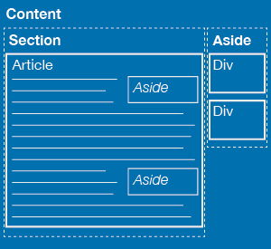
Pages are made up of three main blocks of content: section, article and aside. Content within the main side column must also be placed inside a div tag, seen below. Content inside article tags can also be divided into smaller groups with divs.

Section
Sections make up the main content areas of the page. The main content of a page should be placed in sections, not in the side bar.
Classes
- one-column: Creates a one column page.
- side-main-content: Spans three-quarters of the page, allowing room for a side column.
- half-main-content: Spans half the page, creating a two column page. Two column pages are not recommended. If a two column page is used, the most important information should be in the left column.
Article
Articles make up the smaller blocks of content in a page. Related information should be placed into the same article. Breaking content up into multiple articles can make it easier to scan content on long pages.
Aside
Asides are used for supplemental information pertaining to but not necessary for the understanding of the content around it. A maximum of one main aside can be used per page to make up the side column.
Sizing and positioning
Asides have a default of a width of 50% of the column, are positioned to the right and clear all content to the right - such as images and embedded content. Asides should not be placed inside heading or paragraph tags and are coded as follow:
<aside>
<h6>Heading</h6>
<p>Content</p>
</aside>
Asides can have the following classes applied to adjust position and size:
- quarter, third, half, twothird: Adjusts the width of the aside.
- left: Positions the aside to the left of the column.
- clear: Prevents any content from wrapping to either side of the aside.
- no-clear: Allows content to wrap to either side of the aside.
Use a space to separate classes. Do not use commas or semi-colons.
Note: The numbers in the examples below show the order the asides are coded in, which isn't necessarily the order they are viewed in.
Structure do's and don'ts
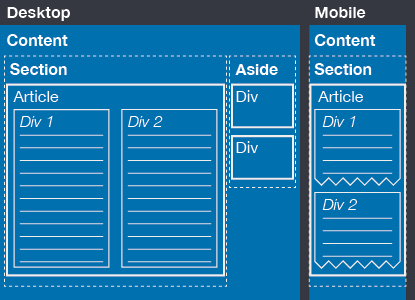
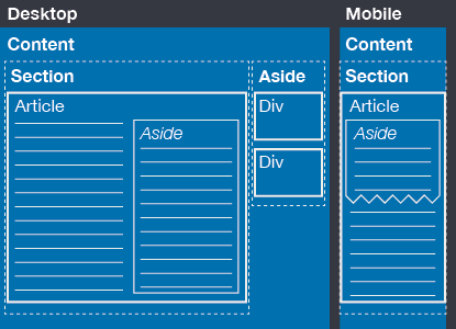
Do not create a multi column layout with asides. More about asides can be found below. Multi column layouts, when necessary, should be created using divs and the width class found in the aside section below.
Figure 1: Do

This layout uses two main divs with a class of half to create the multi column layout. When viewed on a mobile device, the right column will drop below the left column and maintain the original content flow.
Figure 2: Don't

This layout uses an aside to create the multi column layout. When viewed on a mobile device, the aside will be viewed on screen in the location it is placed in the code. In this case, it will be placed immediately following the heading, pushing the main page content below the fold.
